Agile Reports Overview
Overview
Enhance Agile Project Visibility with Agile Reports
Boost your project management and tracking capabilities with Agile Reports, a powerful add-on for monday.com . Gain deep insights and visibility into your agile projects using a variety of charts and flexible settings. Track progress, identify bottlenecks, and keep your team on the path to success.
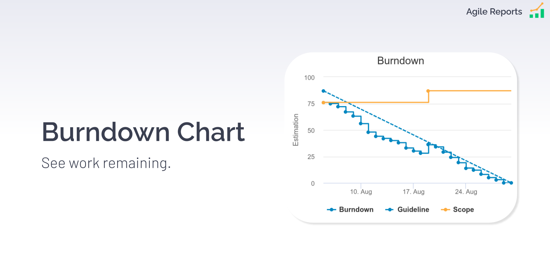
Burndown Chart
- Monitor work remaining versus time for sprints or projects.
- Ensure your team stays on course for successful delivery.
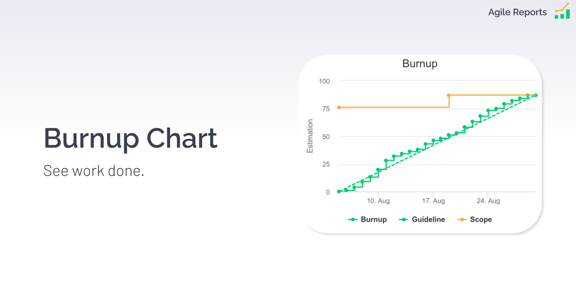
Burnup Chart
- Visualize total work completed and scope changes.
- Understand if your project's scope is evolving or adhering to the plan.
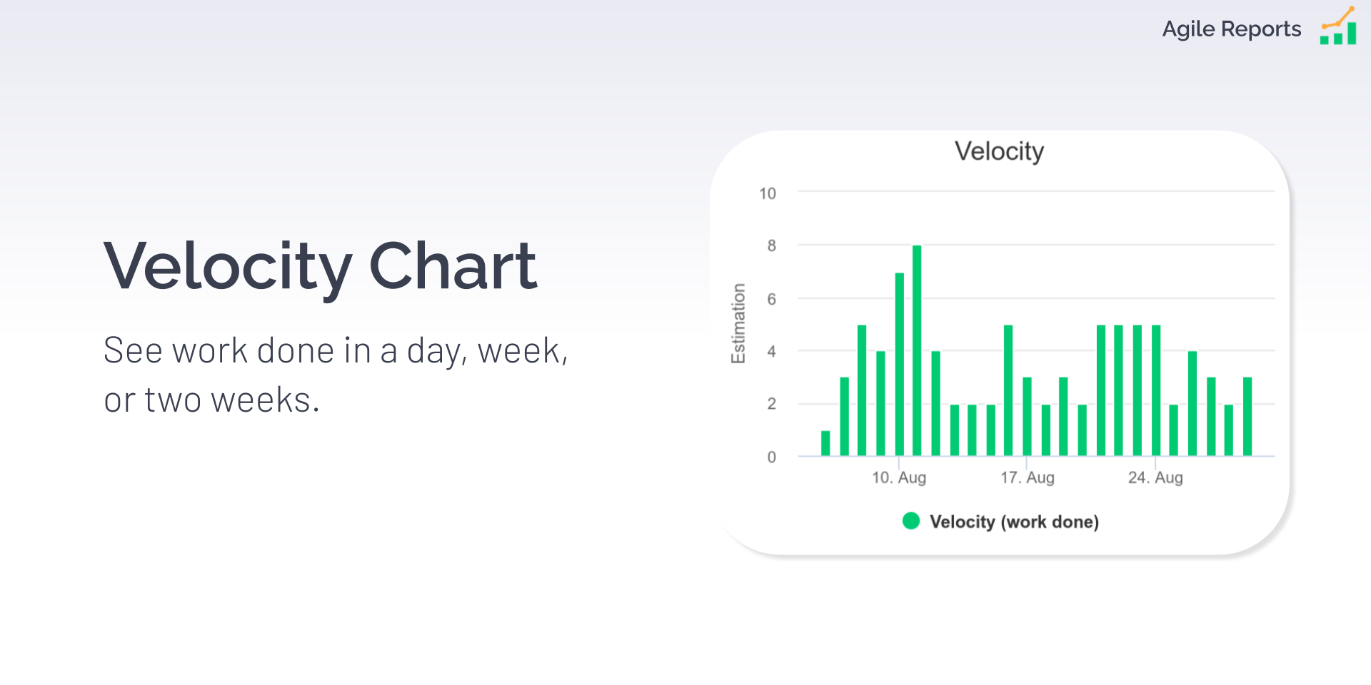
Velocity Chart
- Measure your team's sprint performance over time.
- Optimize your workflow based on historical data.
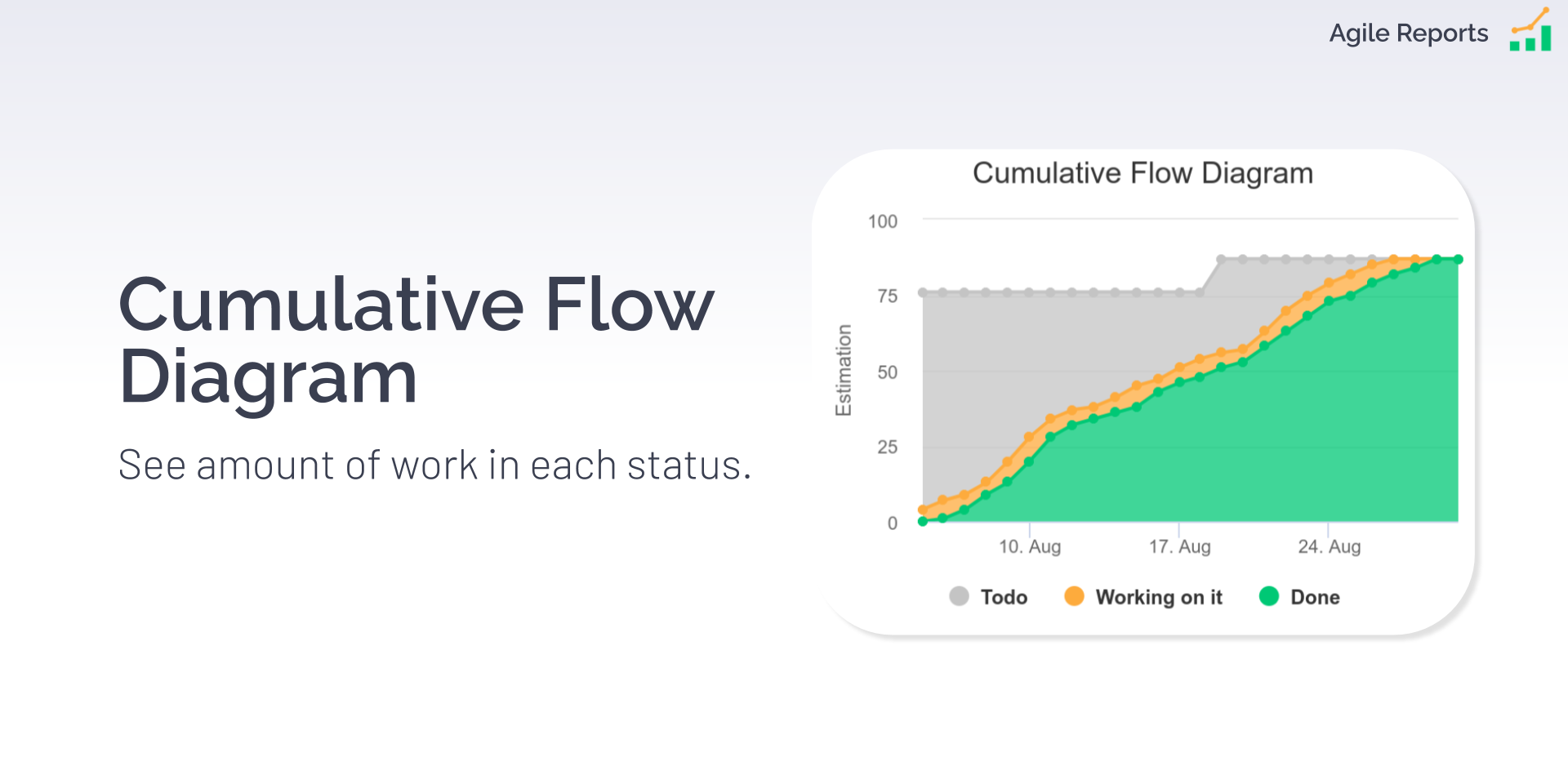
Cumulative Flow Diagram
- Track the flow of work items through different stages.
- Identify workflow bottlenecks and improve efficiency.
Customizations
- Filter items for specific sprints, releases, projects, or teams.
- Set reporting intervals, choose what's displayed, and personalize chart colors to match your preferences.
Why Agile Reports on monday.com?
- Agile Reports empowers you with clear, data-driven insights, allowing you to make informed decisions.
- Enhance collaboration and productivity within your agile teams.
- Keep stakeholders informed with real-time project status updates.
Try it now and bring your agile project management to the next level.
Burndown Chart

A Burndown Chart is a powerful graphical tool used in project management to track the progress of work over time. It provides a clear visual representation of how work items are being completed and how the team is progressing toward the project's goals.
A Burndown Chart is a line chart designed to track value (or the number of items) as it decreases to zero.
Example Use Cases:
- Display the amount of work remaining in project or activity.
- Track the number of support tickets or the size of the inbox.
- Monitor financial commitments, such as paying off suppliers or managing bank debt.
Burnup Chart

A Burnup Chart is a valuable project management tool used to track and display the progress of work items or tasks in relation to a predefined scope or target. It provides a visual way to understand how work is accumulating and whether it aligns with project goals and targets.
A Burnup Chart is a line chart, an excellent tool for tracking values (or the number of items) as they progress towards a specific target.
Example Use Cases:
- Measure the amount of work completed for a project or activity, with the target value being the total amount of work required to finish the project or activity.
- Keep track of the number of support tickets that have been answered.
- Monitor conversions in marketing activities.
- Analyze revenue from sales, with the revenue target as the desired goal.
Velocity Chart

A Velocity Chart is a visual representation commonly used in Agile project management, to track the team's performance and progress over time. It provides valuable insights into the team's work capacity, efficiency, and the pace at which work is completed.
A Velocity Chart is a bar chart specifically designed to track values (or the number of items) over defined time periods, with each bar representing a day, week, or two weeks.
Example Use Cases:
- Display the amount of work completed within specific time periods.
- Track the number of support tickets created or answered during specific time intervals.
- Monitor revenue generated within defined time frames.
Cumulative Flow Diagram (CFD)

A Cumulative Flow Diagram is a powerful visualization tool used in project management. It provides an overview of the flow of work items through a process or workflow over time.
A Cumulative Flow Diagram is a stacked line plot that displays the amount or number of items in each status over a timeline. It is particularly useful for visualizing how items progress through a workflow represented by status values (e.g., Todo, Working on it, Done).
Example Use Cases:
- Visualize the amount or number of items in specific status values.